It’s a waterfall of data — or at least it might as well be. Waterfall charts are used frequently to illustrate how a certain value or series of values decreases, increases, or otherwise changes over time. They are often used for things like product costs, profit margins, and other financial matters. It also seems like in finance, the bigger the numbers, the more that people enjoy using a waterfall chart to convey information effectively.
Table of Contents
What Is a Waterfall Chart?

A waterfall chart visually represents how resources flow through an organization. It shows at what stage each resource was used and what its cost was at each stage. The result is a series of steps that begins at the top with the largest expenses and ends with the smallest ones.
The purpose behind using this Format is to see where large amounts of money are spent on items that don’t directly impact your company’s or organization’s bottom line. In this regard, it’s similar to other types of financial charts like PERT Charts and Gantt Charts.
Waterfall Chart Templates
A Waterfall Chart Template is a pre-designed format used to visually represent and analyze the cumulative effect of positive and negative values on a specific variable over a period of time. This chart is also known as a bridge chart or cascade chart. The Waterfall Chart Template provides a structured framework for presenting the starting and ending values, as well as the intermediate values that contribute to the overall change. This type of chart is commonly used in financial analysis, project management, and performance tracking to illustrate the components that drive a particular outcome or result.
Waterfall Chart Templates assist individuals, professionals, or organizations in visually representing and analyzing the cumulative impact of positive and negative values on a variable. By using these templates, users can input data values, customize the chart’s appearance, and easily identify the components contributing to the overall change. Waterfall Chart Templates facilitate effective data visualization, trend analysis, and data-driven decision-making. These templates are valuable tools for financial analysts, project managers, performance trackers, or anyone seeking to communicate complex data patterns and insights using waterfall charts.
When do you need a waterfall chart?
Waterfall charts are a type of chart that shows the stages in a process over time. The waterfall chart is sometimes called a multi-level pie chart or a level-by-level pie chart. It’s helpful in showing how much money is allocated to each stage of a project or process, such as research and development (R&D), production, sales, and marketing.
You can also use waterfall charts to show how much money you’ve received from different sources over time. For example, if you’re running an event and want to show how much money has been raised from ticket sales compared to donations and merchandise sales, you can create a waterfall chart with three levels: ticket sales, donations, and merchandise sales.
Waterfall charts are also useful for showing financial projections over multiple years, such as when calculating future earnings based on current earnings; however, it’s important to understand that this type of projection isn’t always accurate because it doesn’t take into account all relevant factors that could affect your business in the future.
The benefits of using waterfall charts
Waterfall charts are a type of chart that show a series of steps, with each step represented by a different color. Waterfall charts are used to represent how money is spent on a project and how the money is allocated to other costs.
The main benefit of using waterfall charts is that they help to show the relationship between different costs within a project. Waterfall charts allow users to see how much money has been allocated toward each cost and any overspending or underspending. This makes it easier for users to see where changes need to be made for projects to be completed successfully.
Another benefit of using waterfall charts is that they visually represent how much money has been spent on each cost category. Waterfall charts can also show if there have been any overspends or underspends along the way so that users can make adjustments accordingly.
Waterfall charts also make it easier for users to compare different projects against one another and determine which ones would be more successful if implemented based on the amount of money spent on each activity within each project.
How to create a waterfall chart in Excel
This part will teach you how to create a waterfall chart in Excel. A waterfall chart displays the breakdown of expenses and revenues by different categories.
You can use it for budgeting purposes or to show how much money has been spent on a project or a new venture. The trick is to make sure that your chart makes sense and is easy to understand.
Let’s get started!
Step 1: Create an Excel chart
Start by creating a blank chart in Excel by clicking on the Insert tab, then selecting Charts and selecting the first option – Blank Chart.
In the next step, select Column chart from the dropdown menu under the Type section.
Step 2: Add the series to your chart
To add data to your chart, select any cell in one of the columns of your data table and then click on the Chart Data button located on the right side of your screen.
In the next step, select Use Columns from the Axis dropdown menu under the Axis Options section and then click on the OK button at the bottom right corner of your screen.
Step 3: Make the data table into a chart with columns.
First, make sure that your data table has two columns: one for values and another for percentages. Your goal is to show the contribution of each value to the total sum at any given point in time. This means that if there were two values, X and Y, and they each made up 50% of the total sum, then the first column would include X=100% and Y=100%. If there were three values, A, B, and C, then A=50%, B=25%, and C=25%. In all cases, these figures reflect what percentage of the total sum each individual value contributes to each point in time.
To display this data in Excel 2010 or 2013 (or later versions), right-click on any cell in your data table; select “Table” from the pop-up menu; click on “Design”; then click on “Columns” under Table Options at the bottom left-hand corner of your screen; select “Automatic.”
Step 4: Convert the stacked chart into a waterfall chart
If you have a stacked chart in Excel, you can convert it into a waterfall chart by performing the following steps:
In the Insert tab, select the Recommended Charts section and click Waterfall. This will open up the Chart Tools tab and prompt you to select which data series should be used as your main series (the primary data set). The secondary series will become the labels for each bar in your chart. Double-click any bar in your existing chart to add it as a secondary series; then right-click on any other bar and choose Format Data Point > Fill > Solid Fill.
How to Customize a Waterfall Chart
Waterfall charts consist of a series of bars representing income and expenses, which are grouped by category. The height of each bar shows the total value for the category, while the length of each bar represents an individual item in the category. Waterfall charts are often used to illustrate cash flow.
This part will show you how to customize a waterfall chart.
Use floating columns
If you have more than one row, you can use floating columns to make room for more categories without changing the overall size of your chart. To do this, select all of your data points and then click Format> Columns > Add/Remove Columns. In the dialog box that appears, choose Floating Columns from the dropdown menu at the top and click OK.
Add spacers between each set of data points with two columns per row selected.
This will ensure that your chart is clear and easy to read.
Change the font size for your titles and labels to be large enough for people to see even from a distance.
The font size should be at least 18 pixels for titles and 20 pixels for labels.
Connector lines
The connector lines are the arcs connecting each waterfall chart step. These lines can be straight or curved depending on the information you want to depict, making it more attractive.
Color Coding
Every step of a waterfall chart is assigned a specific color code based on the category it belongs to. For example, if you have a three-month sales report with four departments, then each department will be assigned a different color code (e.g., blue for the marketing department).
Crossover
The crossover is where one division or another crosses over into another. In other words, it’s the point at which one division ends and another begins.
In a waterfall chart, this crossover is represented by a dashed line that connects two divisions. This dashed line represents the transition between different divisions in your data set.
Conclusion
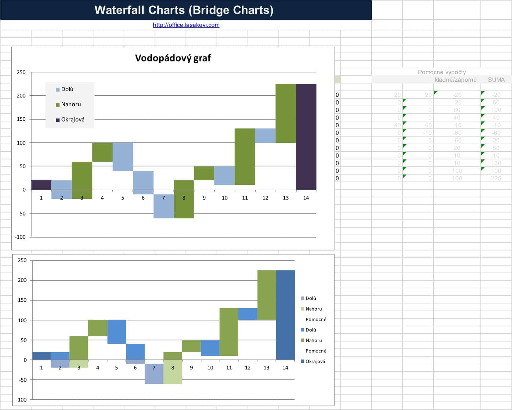
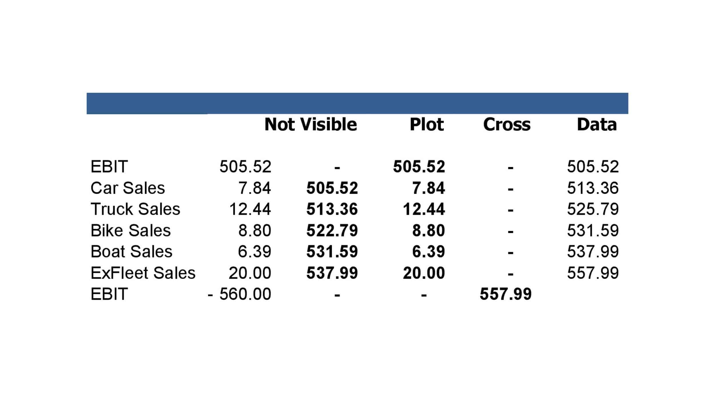
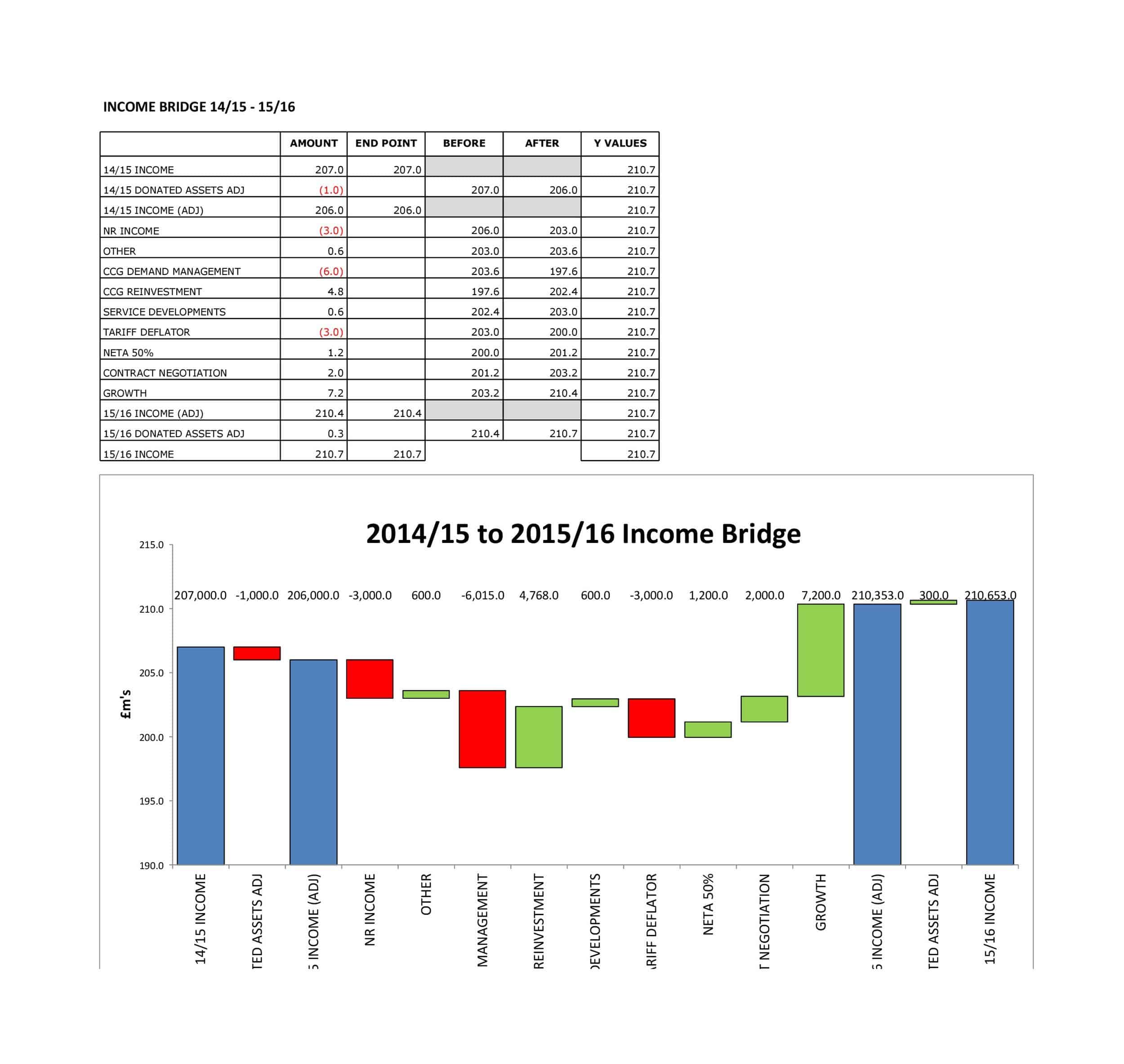
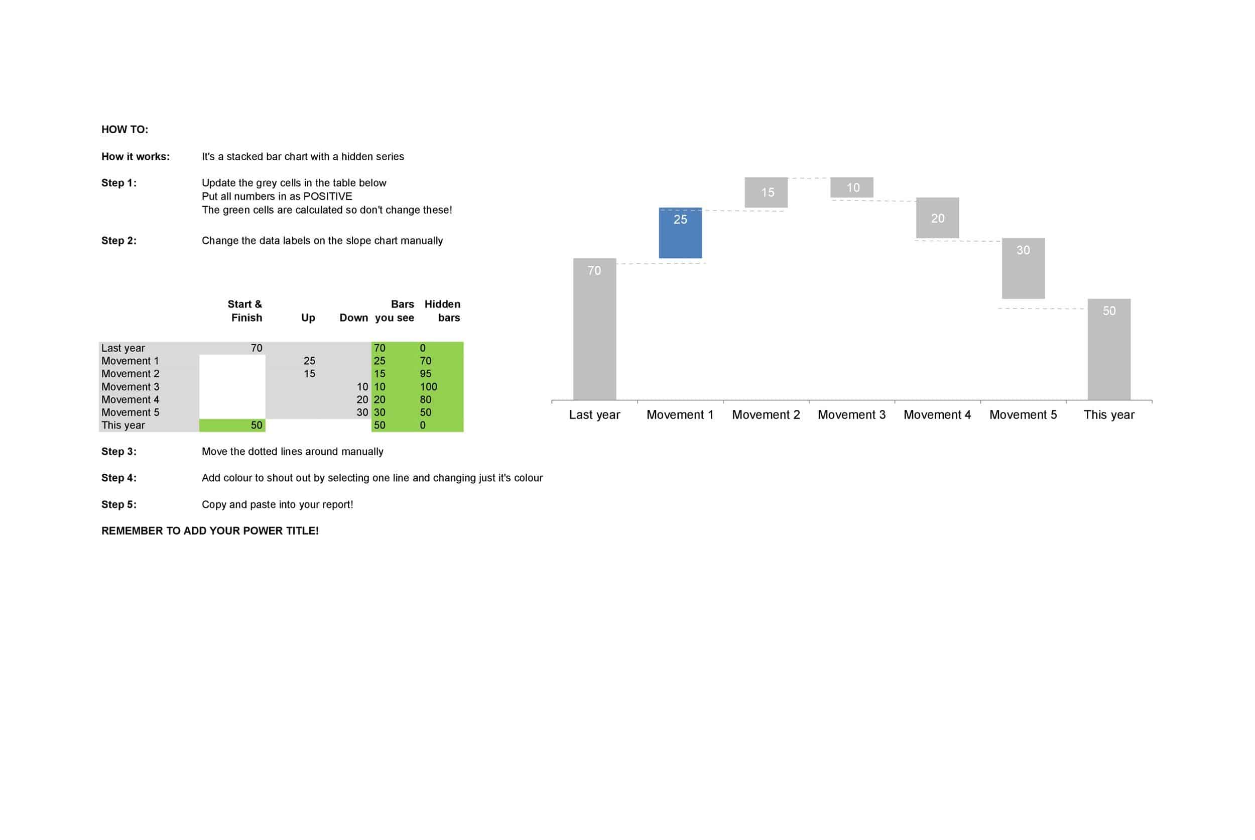
As you can see in the image above, the waterfall chart template is pretty simple. It’s essentially a line graph that details several changes over time. This can help quantify the effects of specific events over the years. However, it can also be compiled using scientific studies or even financial returns to come up with other figures, like new job creation due to troop reduction during wartime.
FAQs
How do I create a waterfall chart in Excel?
In Excel, select your data and go to the “Insert” tab. Click on the “Waterfall” chart option to insert a blank waterfall chart. Customize the chart by adding and formatting the categories, totals, intermediate sums, and connectors.
How to do waterfall chart in Google Sheets?
In Google Sheets, select your data and go to “Insert” > “Chart”. Choose the chart type “Bar chart”, then customize it into a waterfall chart by adjusting colors, adding data labels, and formatting plot lines for totals and intermediate sums.
What is a waterfall chart example?
A waterfall chart example tracks positive and negative values that accumulate to a final net amount. It can show changes over time (ex. monthly sales), or demonstrate how an initial value is impacted by intermediate positive and negative influences.
Is waterfall chart a bar chart?
A waterfall chart has vertical columns similar to a bar chart, but it also includes intermediate total values and colored segments to visually distinguish between positive and negative changes.
What is the difference between a Gantt chart and a waterfall chart?
A Gantt chart displays tasks over a timeline while a waterfall chart displays positive and negative quantitative changes flowing to a total. They are used for different types of data analysis.
What is the difference between a funnel chart and a waterfall chart?
A funnel chart shows progressive quantitative stages while a waterfall chart adds and subtracts values to demonstrate impact rather than progress. A funnel chart flows downward and a waterfall flows vertically.


![Free Printable Credit Card Authorization Form Templates [PDF, Word, Excel] 1 Credit Card Authorization Form](https://www.typecalendar.com/wp-content/uploads/2023/06/Credit-Card-Authorization-Form-150x150.jpg)
![Free Printable Stock Ledger Templates [Excel,PDF, Word] 2 Stock Ledger](https://www.typecalendar.com/wp-content/uploads/2023/08/Stock-Ledger-150x150.jpg)
![Free Printable Financial Projections Templates [Excel, PDF] 3 Financial Projection](https://www.typecalendar.com/wp-content/uploads/2023/05/Financial-Projection-1-150x150.jpg)
