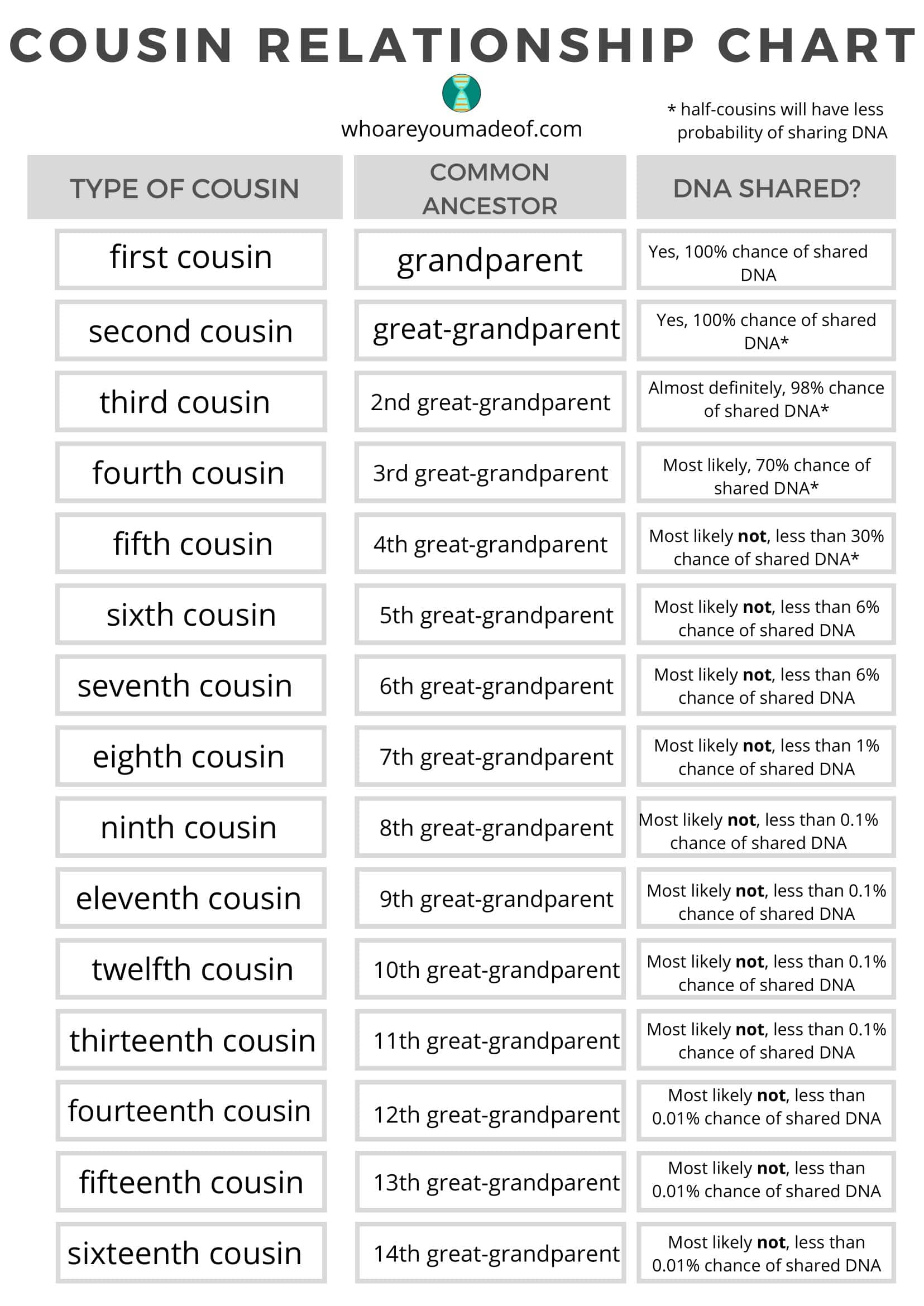
At a family reunion, what exactly is the “daughter of my mother’s cousin” in relation to you? Terms like “first cousin” and “once removed” often get tangled, and the family‑tree chat stalls in minutes. That’s when a Cousin Chart helps: generations run across the top, sibling branches run down the side, and the intersecting cell instantly names the relationship “second cousin,” “first cousin once removed,” and so on.
Table of Contents
TypeCalendar’s 30‑Template Cousin Chart

TypeCalendar has created over 30 Cousin‑Chart templates to fit a range of family‑tree layouts. The classic rectangular scheme uses the common “parent-parent child” layout in the USA, while the “extended grid” containing 6 generations for extended families and the “adoption‑friendly” versions marking adoptive relationships are also located in the file folder. For users with religious or cultural requirements, the “maternal‑paternal split” model separates the maternal side and paternal side with color blocks, so that even the complex genealogical connection is visually simplified.
Cousin Chart Templates
Pick the Format That Fits
- PDF (300 dpi)— crisp prints in A4 or U.S. Letter, plus a 5‑cm margin ruler for scale checks.
- Word (.docx)— locked gridlines but editable text boxes, so you can drop names straight into the chart.
- Google Docs— real‑time cloud editing lets relatives in different cities fill in their own lines simultaneously.
- SVG— infinitely scalable in Illustrator or Canva, perfect for a pixel‑sharp album cover.
- PowerPoint— screen‑share a live kinship guide during Zoom reunions.
Quick Start Guide
When you open the template, the first thing you need to do is write the “root” generation of your family tree, i.e. the grandfather – grandmother duo, in the top row of the table. Then you can set the number of generations with the small double arrow icon on the left edge; if you want to show only the nuclear family, three columns are enough, while for a large structure extending up to six generations, you just need to increase the number of columns with a few clicks. Because the Word and Google Docs versions use free floating text fields, lines stay aligned as you type; each name you enter automatically brings up the correct kinship label “second cousin,” “first cousin once removed,” and so on at the intersection.
For extra clarity, shade Mom’s branch in soft blue and Dad’s in light green; the palette keeps the chart readable and the two clans easy to tell apart. When you’re done, drop the PDF into the family WhatsApp chat or pin the Google Docs link, so relatives can edit it anytime. In minutes, tangled kinships become a clear, unarguable map.
Why Accurate Terms Matter
Rather than Googling every tangled term, you see the relationship instantly on a single table saving time. Correct kinship terms also matter in legal and personal arenas, from estate planning to reading DNA results. TypeCalendar templates clarify the concept of “once removed”, reducing the risk of errors in official document preparation and making family conversations uncontroversial.
Download & Map Your Family Today
Download TypeCalendar’s Cousin Chart bundle now, slot in your relatives’ names, tag their generation with a gray line, and stop mixing up relationships. Within minutes, your sprawling tree becomes an orderly map, ready to carry your family story into the next generation.


![Free Printable Food Diary Templates [Word, Excel, PDF] 1 Food Diary](https://www.typecalendar.com/wp-content/uploads/2023/05/Food-Diary-1-150x150.jpg 150w, https://www.typecalendar.com/wp-content/uploads/2023/05/Food-Diary-1-1200x1200.jpg 1200w)
![Free Printable Credit Card Authorization Form Templates [PDF, Word, Excel] 2 Credit Card Authorization Form](https://www.typecalendar.com/wp-content/uploads/2023/06/Credit-Card-Authorization-Form-150x150.jpg)
![Free Printable Stock Ledger Templates [Excel,PDF, Word] 3 Stock Ledger](https://www.typecalendar.com/wp-content/uploads/2023/08/Stock-Ledger-150x150.jpg)
