The dew point is the temperature at which air, given its current water-vapor content, becomes saturated and condensation begins. Using dew-point values simplifies condensation risk forecasting, especially in meteorology, HVAC design, agricultural scheduling, and industrial process control, because it is more reliable than temperature or humidity alone.
A well-analyzed dew point chart not only provides information about the air temperature, but also how close the humidity is to saturation, whether there is a risk of sweating on surfaces, and whether product storage conditions are safe. It also gives clear answers to high-importance questions such as. Even for professionals, converting daily or hourly readings into clear, color-coded charts is labor-intensive.

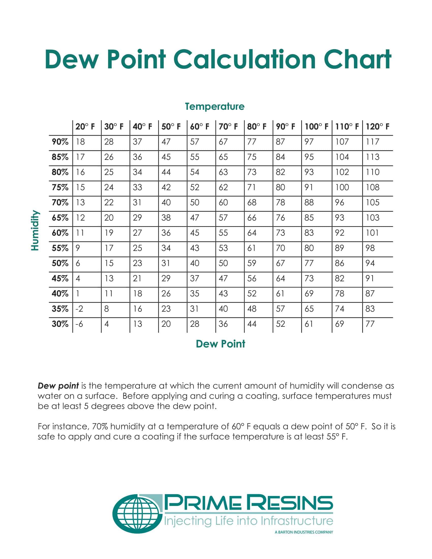
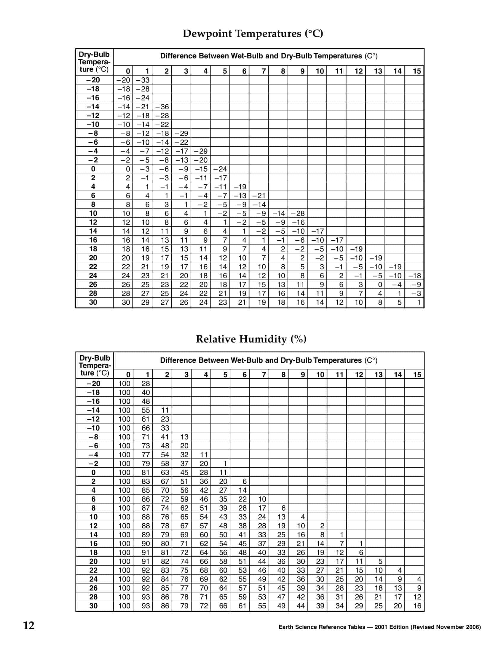
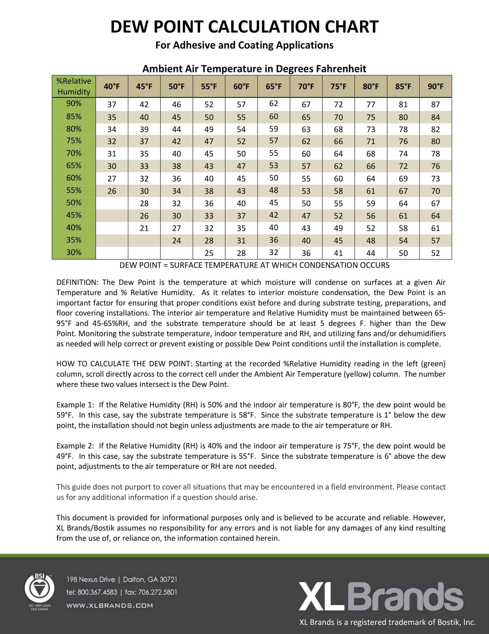
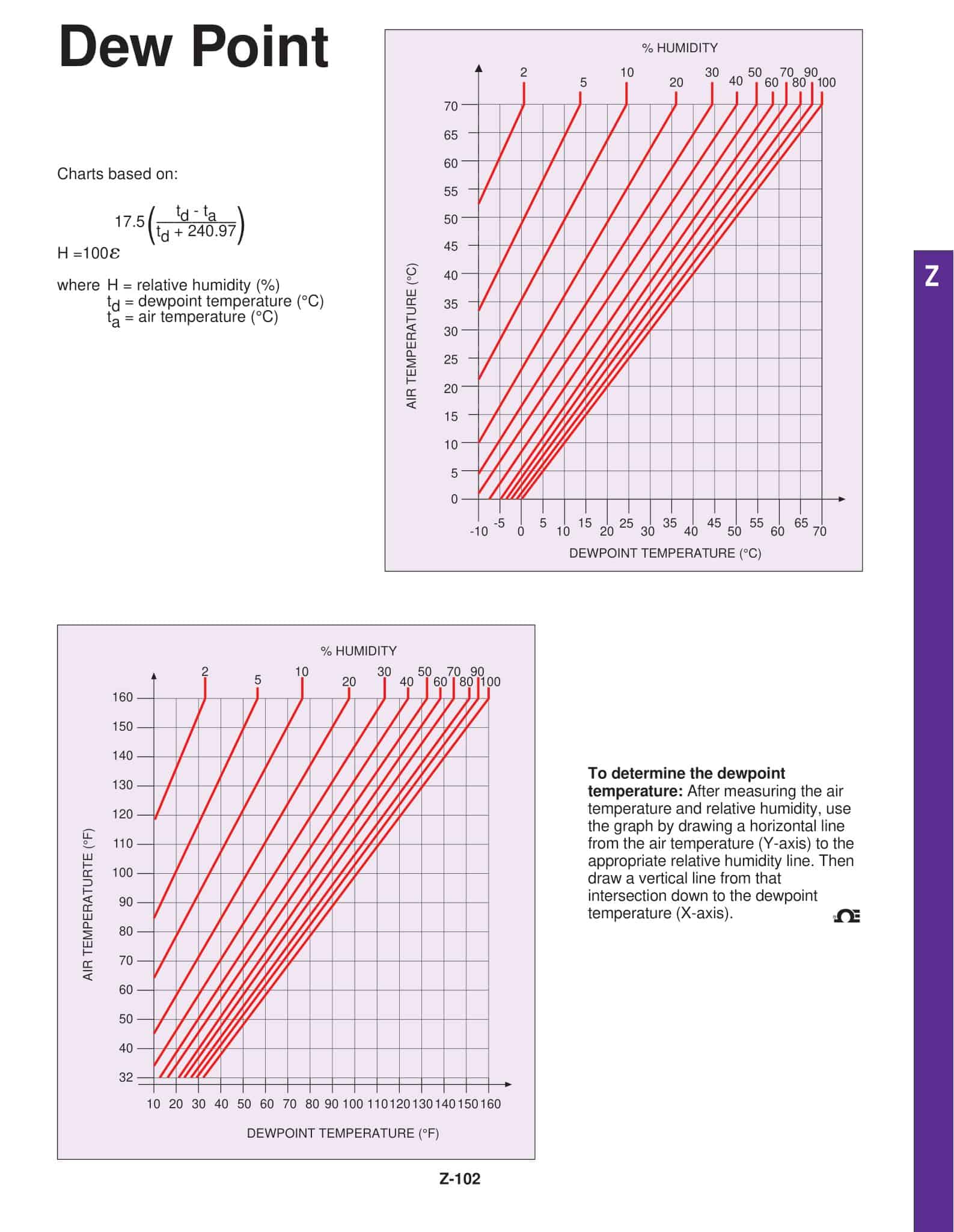
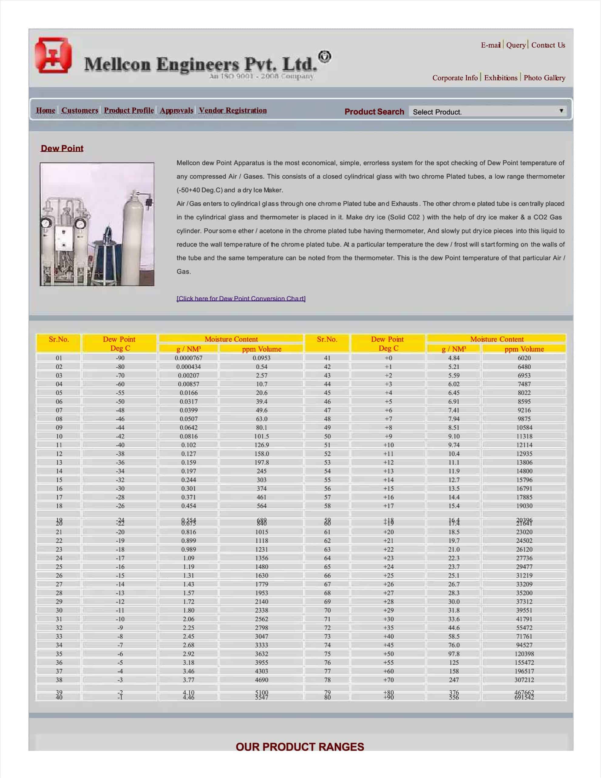
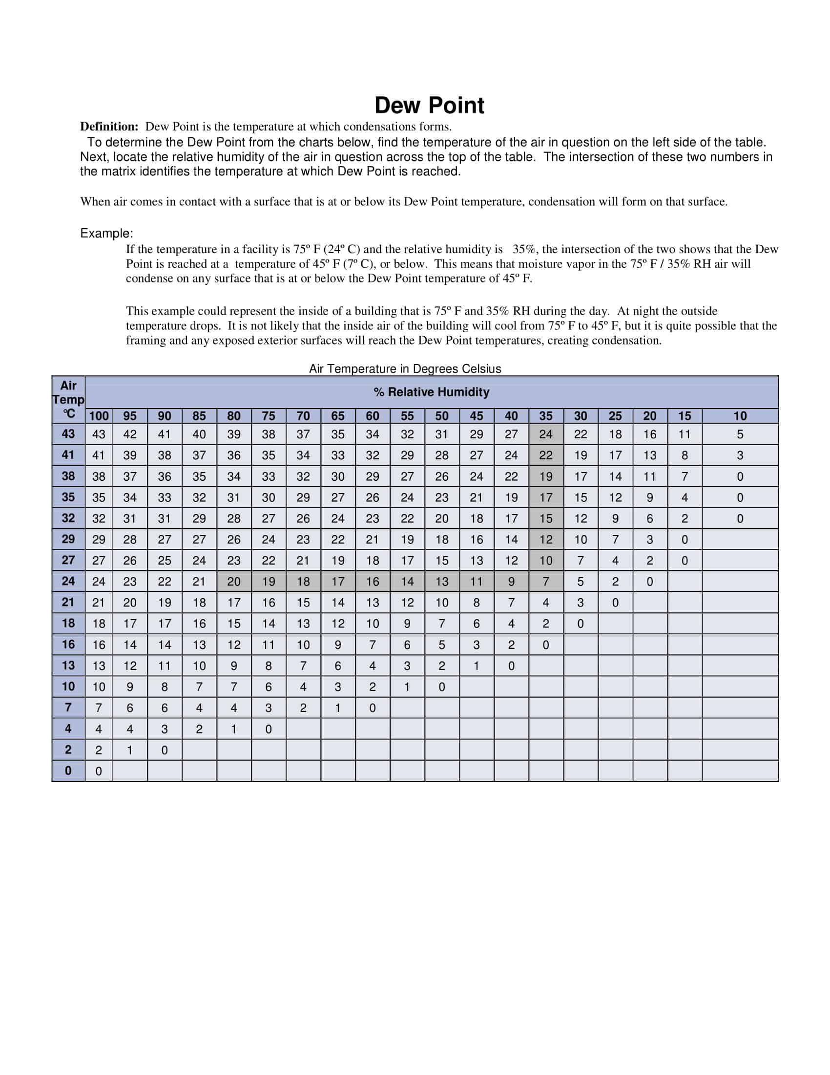
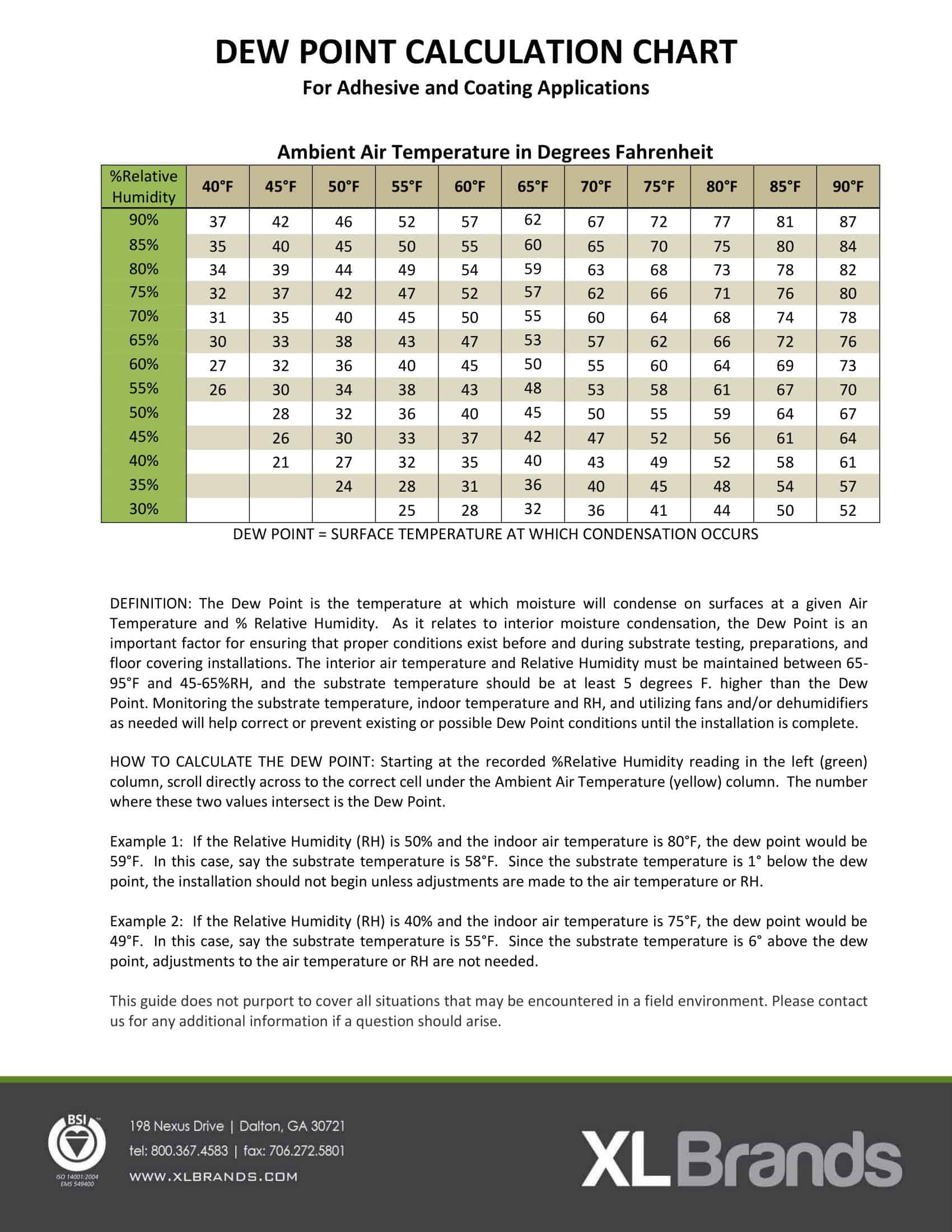
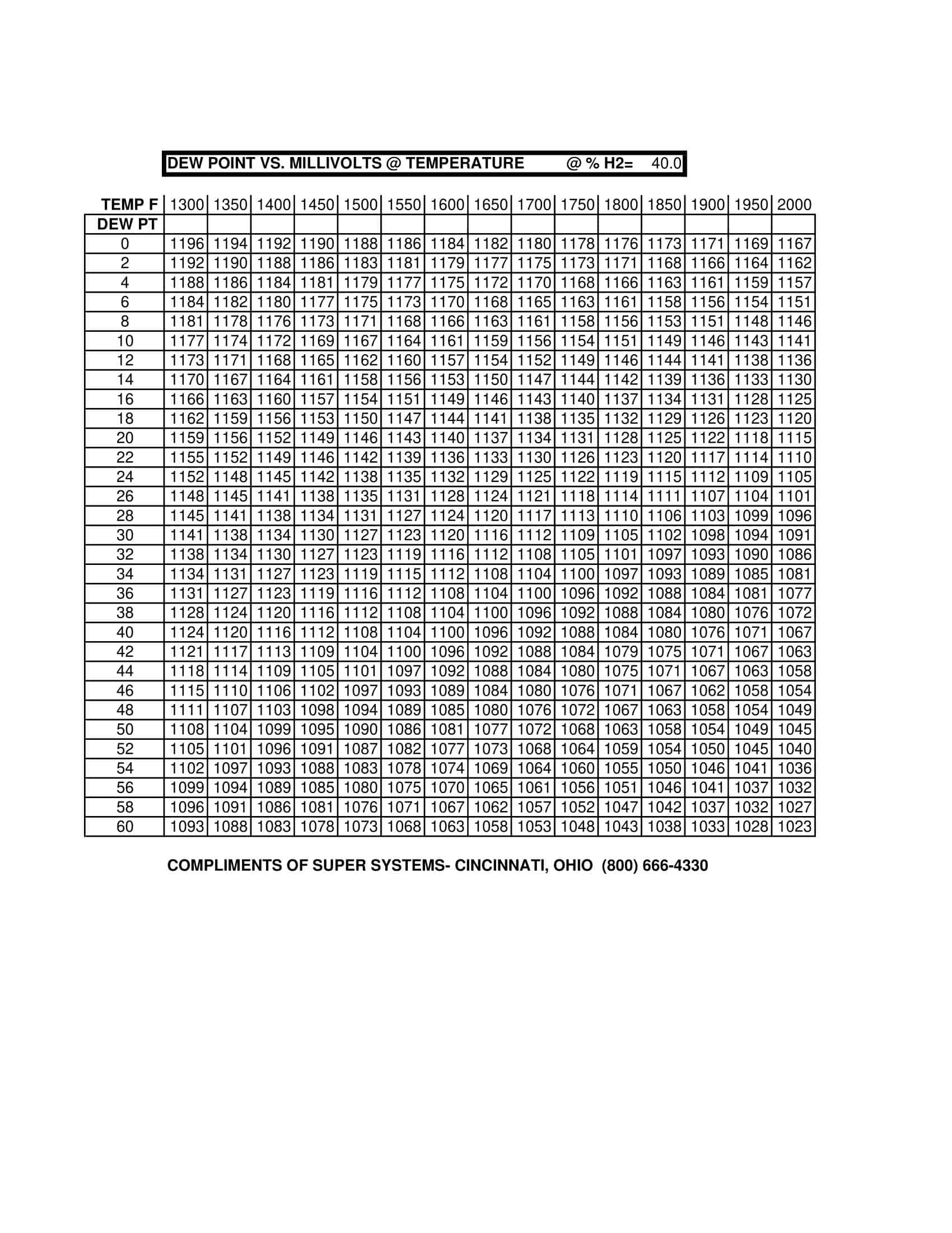
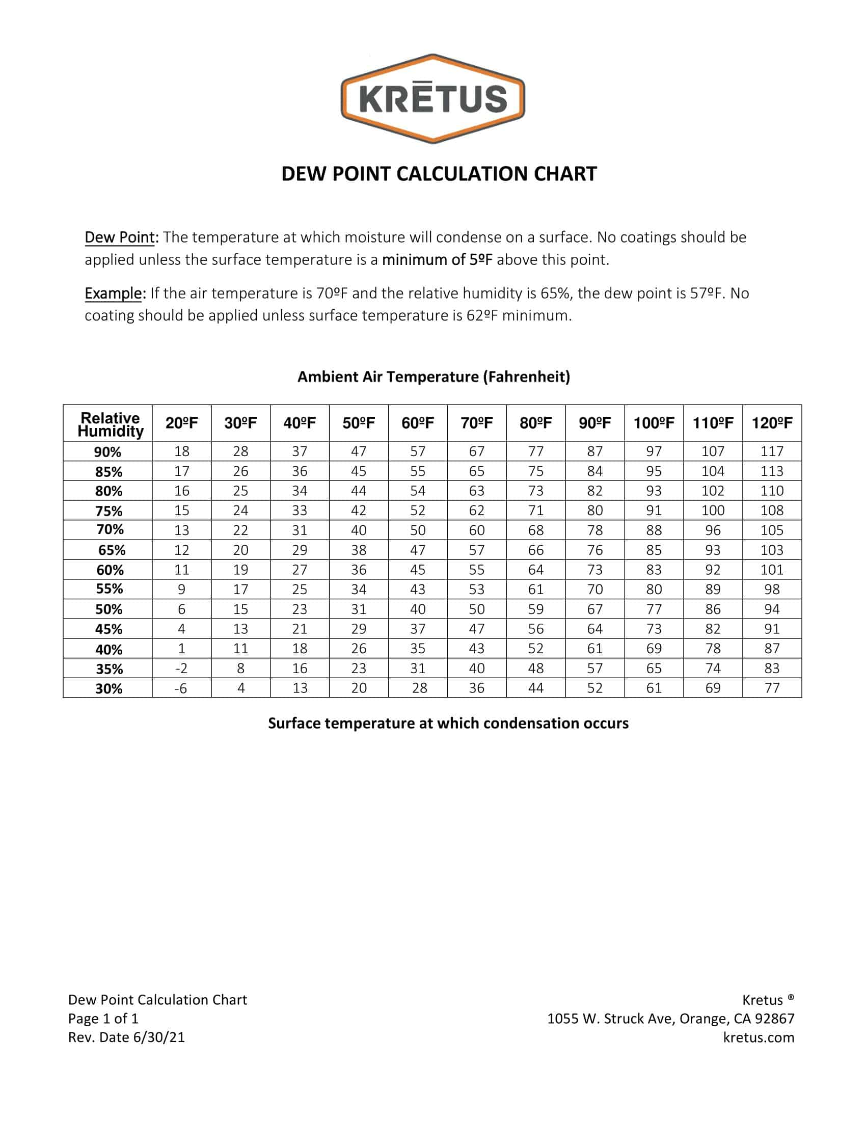
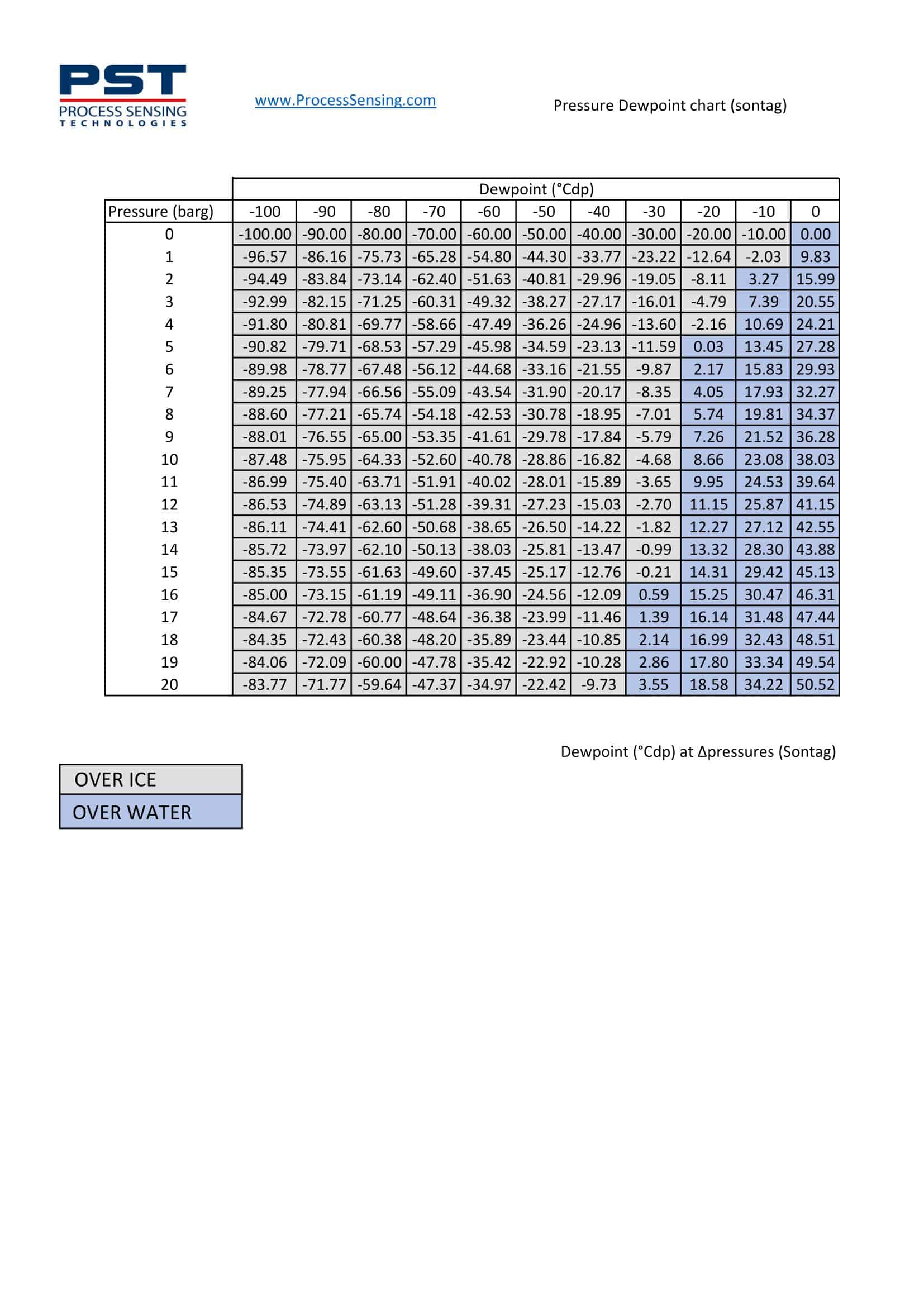
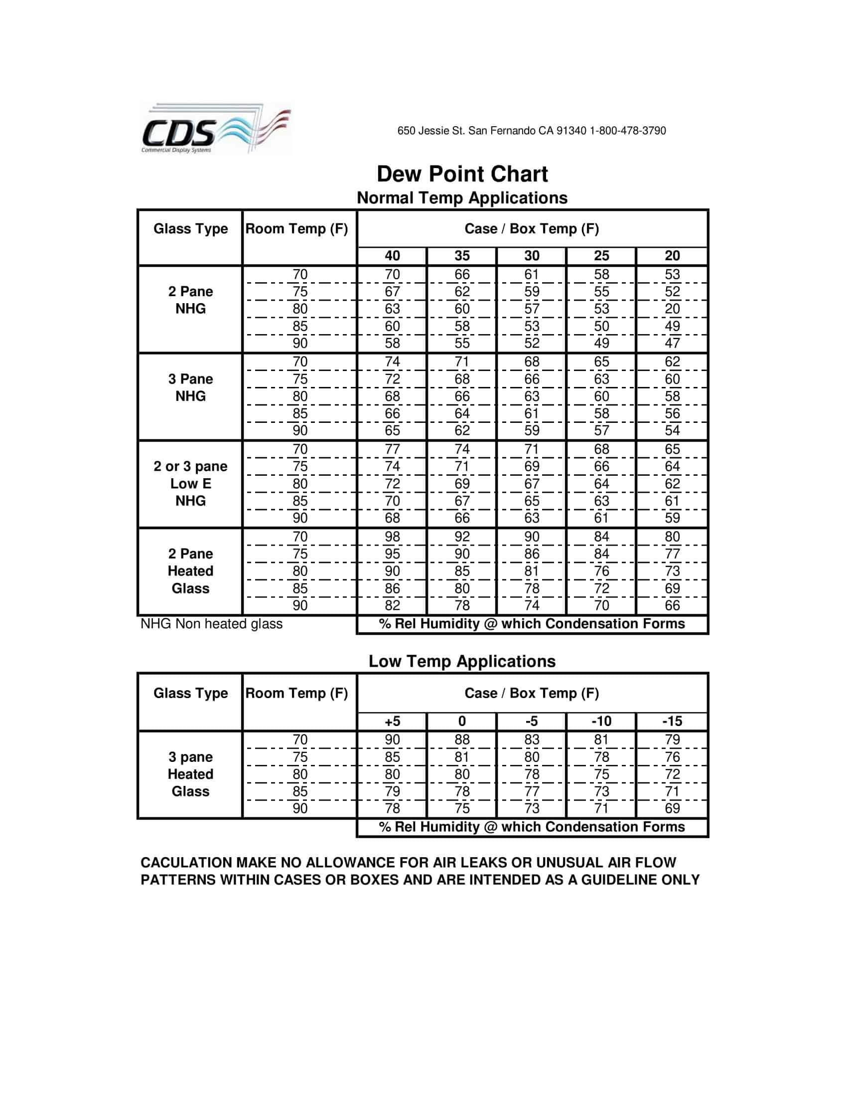
Taking into account all this difficulty, we have created dew point chart templates that are both color, black-and-white, and graphical. More than 35 perfectly and professionally prepared templates meet all your needs. Each template links data columns to the chart, so entering values for Temperature (°F), Relative Humidity (%RH), or Dew Point (°F) instantly generates the plot. If you prefer manual control, built-in Magnus-equation formulas calculate the dew point in milliseconds and automatically plot the result. On the other hand, users who want to find the dew point via the ready-made table can download the PDF and Canva version and have a chart ready for field reporting with high-resolution color palettes.
Table of Contents
Printable Dew Point Charts
Dew Point Chart Template Categories
| Template Name | Use Case | Key Features |
| Daily Dew Point Log | Daily field measurements | Automatic timestamp, color-changing line chart |
| Dew Point vs. Temperature Scatter | HVAC & insulation analysis | Condensation risk zone shading |
| Monthly Dew Point Profile | Agricultural climate monitoring | Average, maximum, and minimum band chart |
| Dew Point & Heat Index Overlay | Human comfort analysis | Dual-axis dynamic chart |
| Multi-Location Dew Point Dashboard | Chain store & warehouse network | Synchronized cards for five locations |
Since each chart is coded with a red-orange risk palette and a blue-green safe space palette, the “condensation hazard” zones are immediately noticeable on the screen. The slice charts on the side panel provide a fast status assessment by showing the “ideal/medium risk/critical” time percentages on a day-to-day basis. A ‘Data Drop’ field lets you paste an entire CSV in one step.
There are three main advantages of using these ready-made templates: first and foremost, time savings. You forgot to write formulas from scratch and scale calculations. Another one is consistency. All field teams provide reports with the same visual standard, so everyone who looks at the data instantly captures a common language. The last one is a deep analysis. Conditional formatting flags threshold exceedances immediately, so you can respond before damage occurs.
Need a polished dew-point chart packed with graphics? Choose any of our 35-plus templates free and download the file type that fits your workflow.. Share it digitally or print it for the field, either way, setup takes seconds. If you want to streamline humidity control without tedious checks, TypeCalendar dew-point charts are a smart and high-accuracy choice.










![Free Printable Morse Code Charts [Numbers, Alphabet] 1 Morse Code Chart](https://www.typecalendar.com/wp-content/uploads/2023/09/Morse-Code-Chart-150x150.jpg)

![Free Printable Food Diary Templates [Word, Excel, PDF] 3 Food Diary](https://www.typecalendar.com/wp-content/uploads/2023/05/Food-Diary-1-150x150.jpg 150w, https://www.typecalendar.com/wp-content/uploads/2023/05/Food-Diary-1-1200x1200.jpg 1200w)
