Last updated:
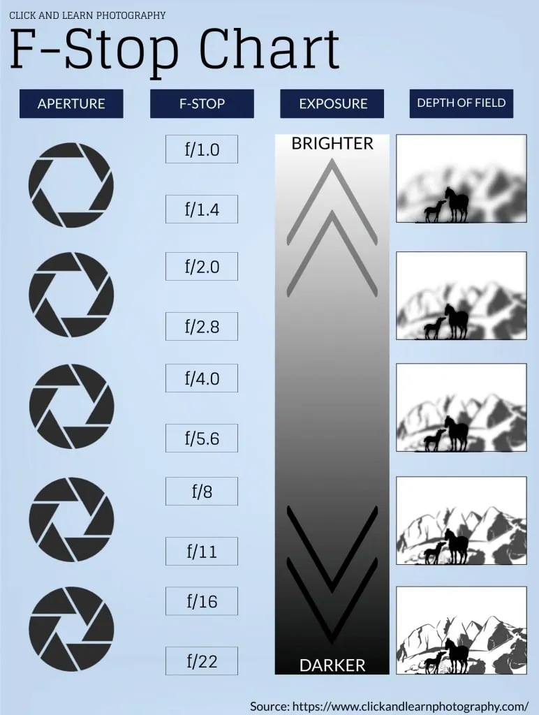
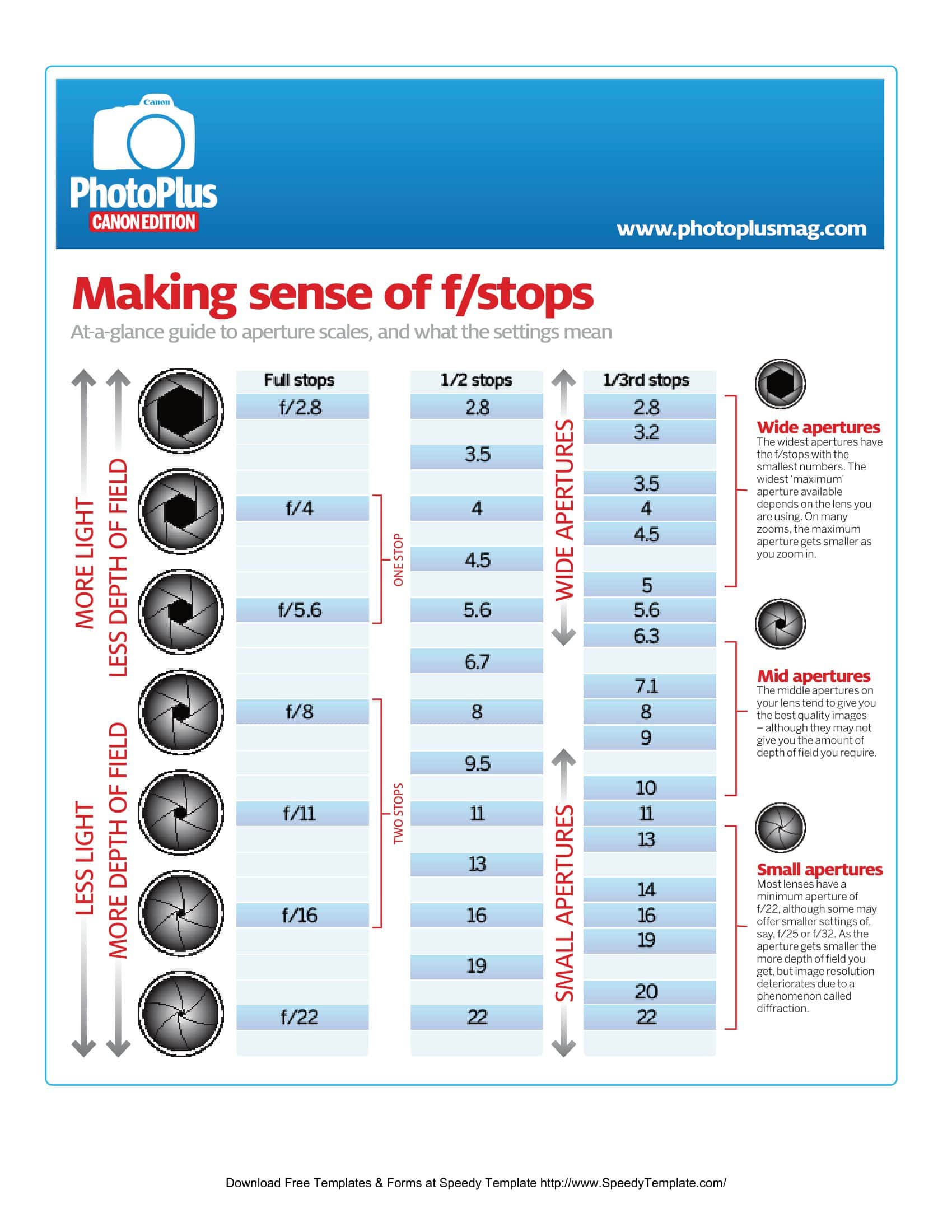
The “1.4 – 2 – 2.8 – 4 – 5.6 – 8 – 11 – 16 – 22” marks on a lens ring are simply a shorthand for the math that powers photography. An F‑stop chart turns those numbers into an at a glance guide to light level, depth of field, and the sharpness‑vs‑diffusion trade‑off. Whether you’re balancing studio strobes, swapping lenses outdoors, or adding an ND filter, a clear chart answers the nagging question, “How many stops did I just lose?”—and saves real time. That’s why TypeCalendar offers free printable F‑stop charts and templates built for the field, the classroom, and the post production desk.
Table of Contents
Why the F‑Stop Chart Is More Than Just Numbers

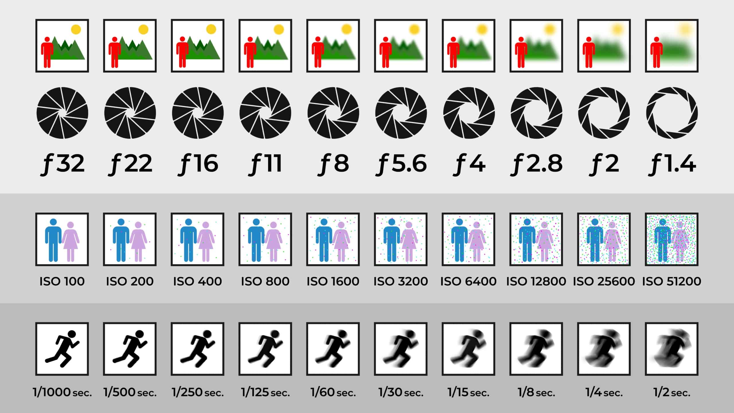
The F‑number answers not only “How wide or narrow is the aperture?” but also anchors the exposure triangle you create with shutter speed and ISO. In our diagrams each stop is a stair step; on the riser you’ll see its matching exposure pair—e.g., f/4 → 1/125 s → ISO 100. Drop one stop and the ladder shifts to f/5.6 → 1/60 s → ISO 100 or keep f/4 and bump ISO to 200 for the same exposure. So the “Which variable should I sacrifice?” decision moves from mental math to an intuitive visual cue.
F-Stop Chart Templates
How We Built Our F‑Stop Chart Template Pack
Rather than cramming everything onto one poster, we built modular layers that match each user’s shooting and learning style:
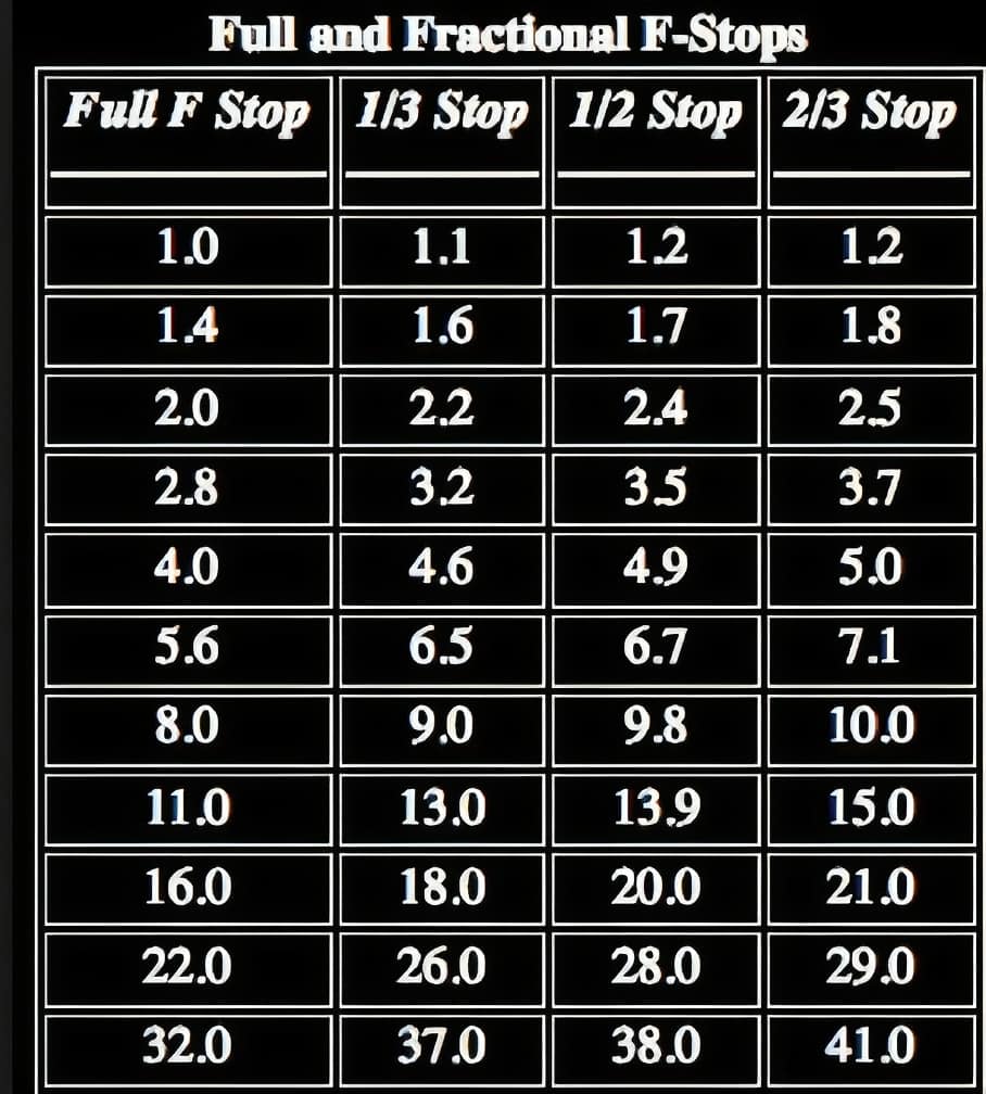
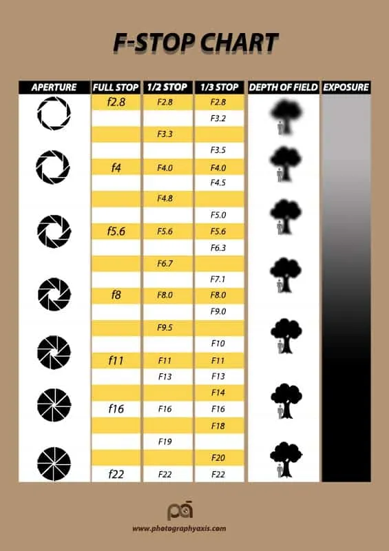
- Classic F‑Stop Ladder – Full‑ and 1/3‑stop sequence (f/1.4, f/1.6, f/1.8, …) in a large, plain font perfect for a wall poster or quick digital reference.
- Depth of Field Version – Shows relative DoF bands and each lens’s “sweet spot” (typically f/5.6–f/8) for full‑frame and APS‑C sensors.
- ND Filter & Compensation Table – A two‑axis chart that answers, “I added a 6‑stop ND and want to stay at f/2.8; what shutter speed do I need?”
- Shutter‑ISO Equivalence Card – Wallet‑size cheat‑sheet listing shutter and ISO pairs that keep exposure constant when the f‑stop is fixed.
- Blank Worksheet – PDF grid for students to fill in stop relationships during class or self study.
Design Choices That Maximize Readability
The palette shifts gradually darker mirroring the journey from wide to closed apertures yet stays pastel enough to keep contrast when printed in black and white. The markings in 1/3 stop intervals were not separated by micro lines, but by small, eye-friendly dots;The question “full stop or 1/3?” is answered with a single glance.Table titles use a clean, technical sans‑serif, and nothing drops below 8 pt on A4 still crisp even on a photocopy. In the ND table we write “1 Stop, 2 Stops” rather than “+1, +2,” so beginners don’t mistake the plus sign for extra exposure.
File Formats and Print Ready Specs
We’ve created 20‑plus F‑stop‑chart files in PDF, Word (.docx), Google Docs, SVG, and PNG. The PDFs are set to 300 dpi in A4/US Letter and poster (A3) sizes; the lines are not cropped when you select “Actual Size” in the printer.In Word and Google Docs versions, you can change the color palette according to your brand, add your course’s logo or open quick note fields next to it.SVG vector files scale infinitely in Illustrator, Figma or Canva, so the lines don’t pixelate when you print a giant classroom poster.Heading to the field? Print wallet‑size cards on 250 g/m² stock and laminate them for durability.
Download Your Free F‑Stop Chart and Master Exposure
The F-Stop Chart printable and template collection on TypeCalendar is completely free and watermark-free. Use them for pre‑shoot planning, classroom lessons, field reference, or just a memory refresher whatever the purpose, pick your format, download it, and try it on your next shoot.Instead of memorizing numbers, you’ll control exposure faster. like climbing a visual ladder.









![Free Printable Stop Sign Templates [Word, PDF] Blank Editable 2 Stop Sign](https://www.typecalendar.com/wp-content/uploads/2023/09/Stop-Sign-150x150.jpg 150w, https://www.typecalendar.com/wp-content/uploads/2023/09/Stop-Sign-1200x1200.jpg 1200w)
![Free Printable Pie Chart Templates [Excel, PDF, Word] Maker 3 Pie Chart](https://www.typecalendar.com/wp-content/uploads/2023/06/Pie-Chart-150x150.jpg 150w, https://www.typecalendar.com/wp-content/uploads/2023/06/Pie-Chart-1200x1200.jpg 1200w)
