Welcome to our comprehensive guide on T Charts. In this article, we venture deep into the world of this versatile instrument that has transformed the way we organize information and make decisions across numerous domains.
Whether you’re an educator exploring different teaching tools, a business professional seeking effective strategies for data presentation, or a student aiming to streamline your study methods, the insights offered here on the usage, benefits, and best practices for creating T Charts will prove invaluable. Embrace the journey as we illuminate the diverse applications and potential of this powerful organizational tool.
Table of Contents
What is a T-Chart?
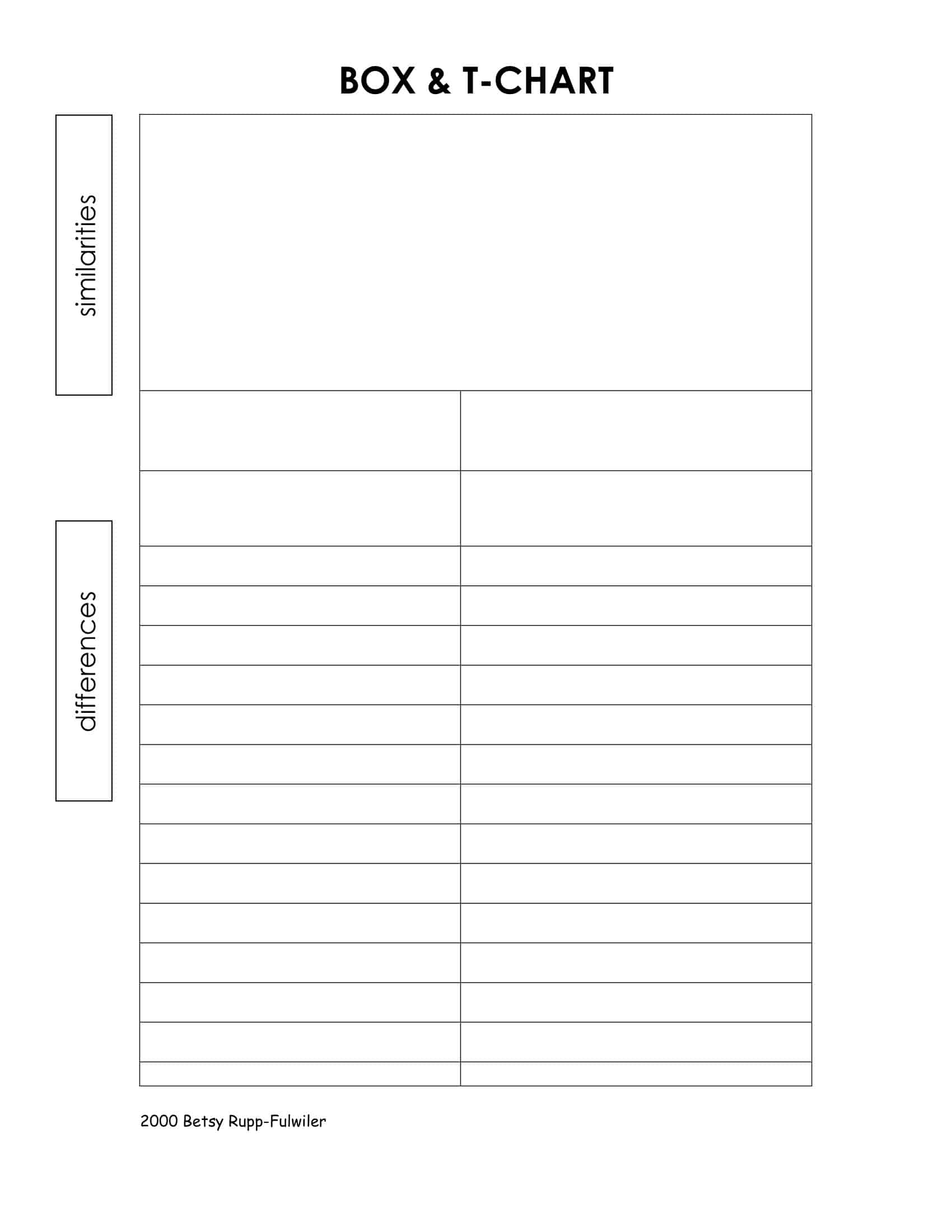
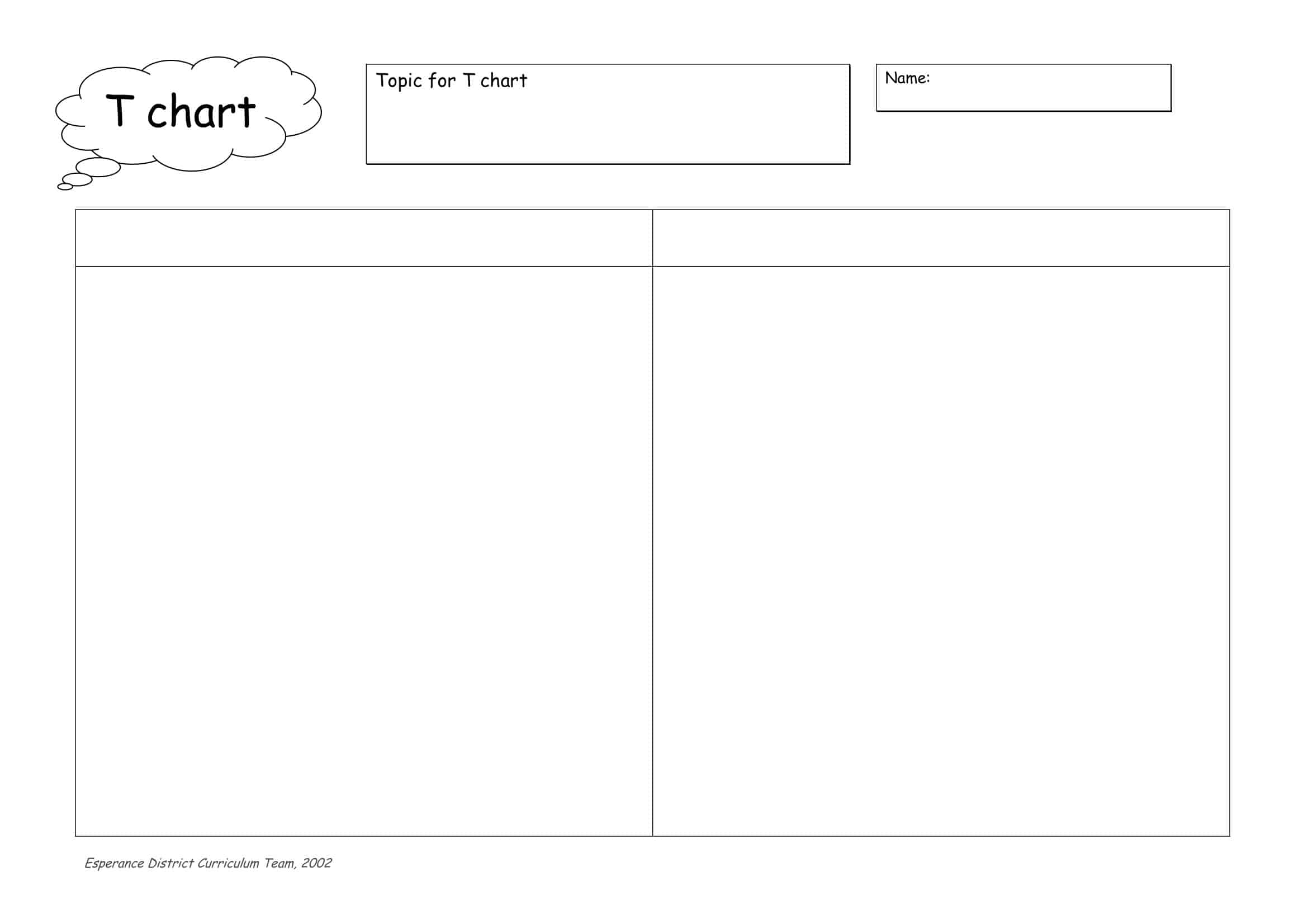
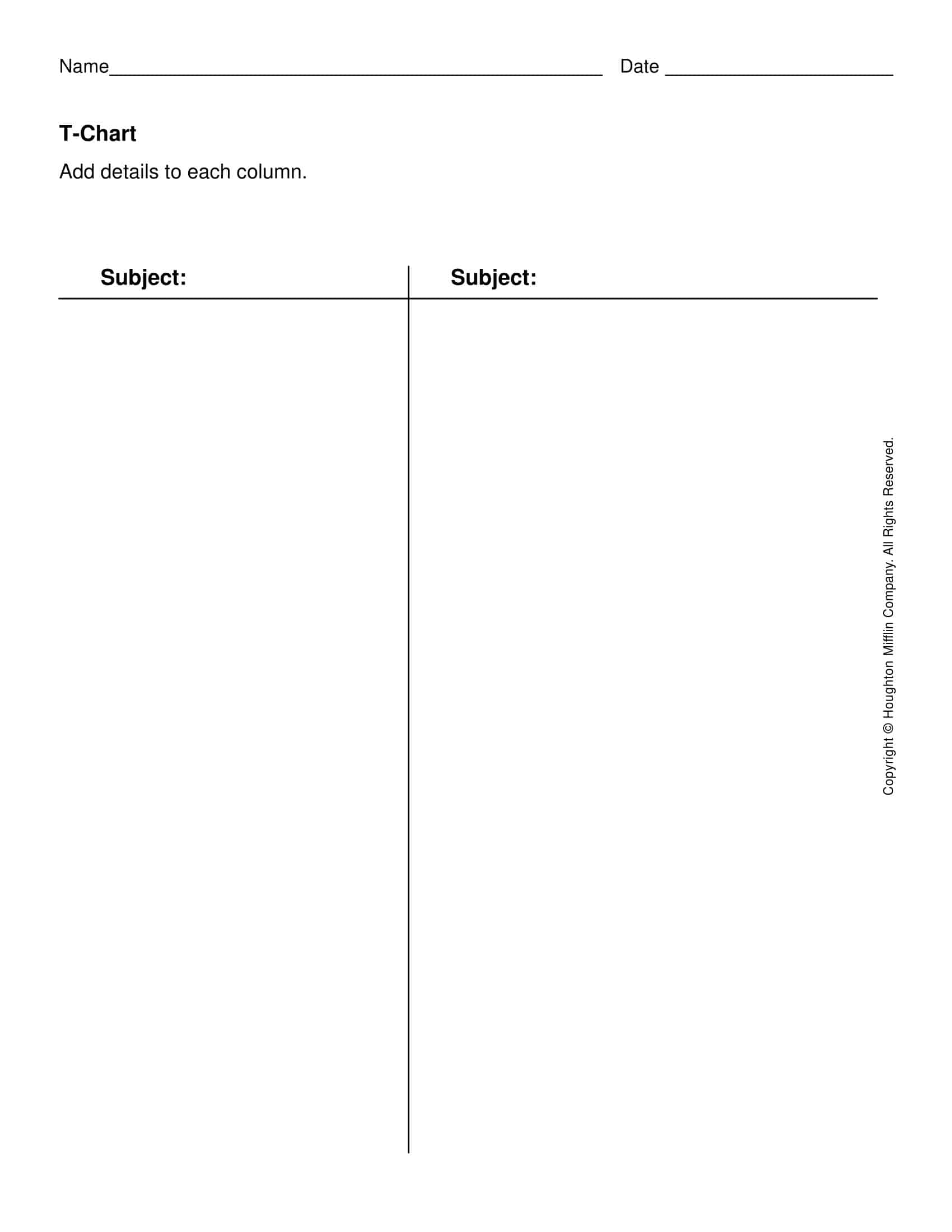
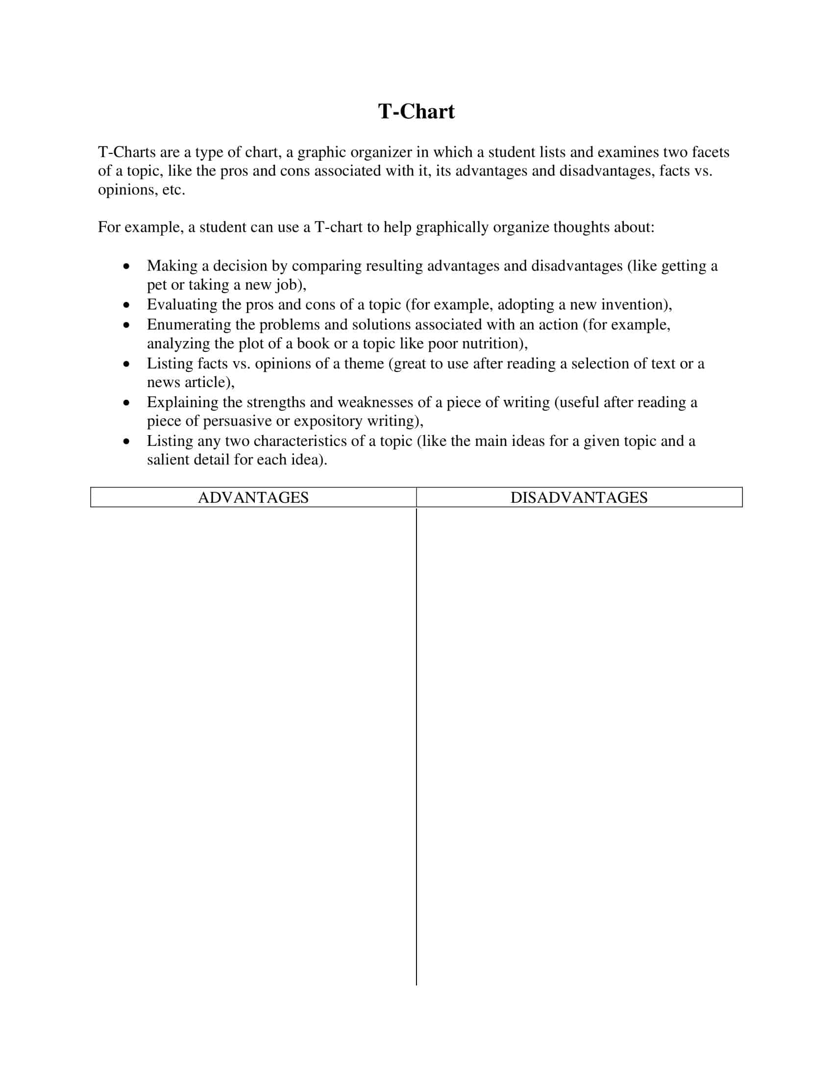
A T-Chart is a type of graphic organizer that helps people organize and visualize information in a structured manner. As the name implies, it is shaped like the letter “T,” with a line running down the middle of a box. The two resulting columns are used to compare, contrast, or consider two aspects of a topic or problem.
For example, in decision making, the left column may represent the pros of a situation, while the right column represents the cons. In an educational setting, a T-Chart can be used to compare two literary characters, two historical periods, or two scientific concepts. Its simple structure and flexibility make it an effective tool for facilitating clear, analytical thinking.
T-Chart Templates
T-Chart templates serve as an efficient tool for organizing and categorizing data in a visually comprehensible format. They offer simplicity and flexibility, making them ideal for a wide range of applications, including academic research, business planning, and decision-making scenarios.
A T-Chart template, as the name suggests, takes the form of the letter “T”. This structure, consisting of two columns separated by a vertical line, encourages the visual partitioning of data. The top of the ‘T’ usually represents the topic or issues to be compared, and the two stems or columns represent two contrasting or complementary aspects.
The left and right columns of a T-Chart template are typically used to list ideas, characteristics, or events related to a central theme, but in different contexts. For instance, pros and cons, strengths and weaknesses, facts vs. opinions, causes and effects, and comparisons and contrasts between two items or topics can be easily represented using this format.
When should you use to T-Chart?
T-Charts are a versatile tool that can be utilized in a variety of situations. Here are some detailed instances where T-Charts could be put to good use:
Decision Making
When faced with a decision, a T-Chart can be used to weigh the pros and cons. By listing the advantages and disadvantages side by side, one can visualize the implications of each choice, which can lead to more informed decision-making.
Comparative Analysis
T-Charts are excellent for comparing and contrasting two items, concepts, or ideas. For instance, in an educational setting, a student could use a T-Chart to compare two characters in a novel, two historical periods, or two scientific theories. The visual layout helps to highlight similarities and differences clearly.
Process Evaluation
In project management or business, T-Charts can be used to outline the steps or tasks in a process and their corresponding outcomes or potential problems. This can help teams identify areas for improvement and develop strategies for optimization.
Cause and Effect Analysis
A T-Chart can be employed to understand cause-and-effect relationships. One column lists causes, and the corresponding column lists the effects.
Brainstorming
When brainstorming, a T-Chart can be a useful tool for organizing ideas. For example, one column might contain the main idea, while the other lists supporting details or evidence.
Classifying or Categorizing Information
T-Charts can be used to categorize or classify information into two distinct categories. This is particularly useful in fields like biology (to classify organisms) or literature (to classify types of literature or literary devices).
Vocabulary Development
In language teaching and learning, T-Charts can be used to help students understand new vocabulary. One side of the chart can contain the new word, while the other side can contain definitions, synonyms, antonyms, or sentences using the word.
Benefits of Using T-Chart
T-Charts offer numerous benefits across various fields and disciplines, whether it be in education, business, project management, or personal decision-making. Below, we delve into the key advantages of using T-Charts, providing examples to illustrate each benefit:
It Improves Clarity of Thought.
T-Charts aid in clarifying thoughts by structuring and separating different aspects of a topic, concept, or idea. For example, a student reading a complex novel might use a T-Chart to differentiate the motivations of two main characters, providing a clear understanding of each character’s actions.
It Facilitates Decision Making.
T-Charts are an effective tool for visualizing the pros and cons of a decision, making it easier to weigh options and choose a path. Suppose you’re contemplating whether to buy or lease a car. A T-Chart listing the advantages and disadvantages of both options can provide a visual aid that simplifies the decision-making process.
It Enhances Comparative Analysis.
By using a T-Chart, two elements can be compared and contrasted efficiently. In a business setting, for instance, a T-Chart can be used to compare the features of two competing products in the market, enabling a company to understand its competitive position better.
It Aids in Problem Solving.
When faced with a problem, a T-Chart can help break it down into manageable pieces, making it easier to address. For example, in project management, a T-Chart could be used to list problems on one side and potential solutions on the other, facilitating systematic problem-solving.
It Simplifies Data Organization.
T-Charts are excellent for categorizing data and maintaining organization. A biology student, for instance, could use a T-Chart to classify different species of animals based on specific characteristics, aiding in memorization and understanding.
It Promotes Active Learning.
Particularly in educational settings, T-Charts encourage active learning by prompting students to engage with the material, rather than passively receiving information. For example, a history student might use a T-Chart to compare two historical events, promoting deeper engagement and comprehension.
It Boosts Critical Thinking.
By encouraging the comparison of different perspectives, analysis of cause and effect, and weighing of pros and cons, T-Charts can significantly enhance critical thinking skills. A literature student comparing themes across two literary works using a T-Chart will need to engage their critical thinking skills to analyze and interpret the works.
Versatility
T-Charts can be used in any field where there’s a need to analyze, compare, or make decisions based on two sets of information. Whether it’s a personal choice, like deciding on a diet plan (listing the benefits and drawbacks of each option), or a professional task, like evaluating project risks (listing potential risks and their mitigating measures), a T-Chart can be an invaluable tool.
Limitations of a T Chart
While T-Charts are a simple and effective tool for organizing and analyzing information, they are not without limitations. Here are some of the key limitations of T-Charts:
Simplification of Complex Issues: T-Charts, with their two-column format, are excellent for comparing and contrasting two simple concepts or ideas. However, they may oversimplify more complex or multifaceted issues. For example, when analyzing a decision with multiple interconnected factors, a T-Chart might not adequately represent the complexity and interplay of these factors.
Binary Limitation: T-Charts inherently rely on a binary structure. This means they are designed to compare twoโand only twoโelements at a time. If there’s a need to compare three or more items, a T-Chart might not be the most suitable tool.
Lack of Hierarchical Structure: T-Charts do not inherently include a hierarchical or prioritization structure. If some points are more important than others, this is not immediately evident in a T-Chart. Other types of charts, like decision matrix charts, may be better suited for tasks involving ranking or prioritizing.
Absence of Visual Appeal: T-Charts are straightforward and utilitarian in design, but they may lack the visual appeal of other types of charts or infographics. This can make them less engaging or memorable, particularly in presentations or public-facing documents.
Limited Space: Depending on the medium in which the T-Chart is created, there may be limited space for each entry. This can make it difficult to provide detailed information or explanations within the chart, especially if the points to be listed are complex or require a significant amount of text.
Doesn’t Account for Neutrality or Ambiguity: T-Charts are designed to be clear and decisive, comparing one side directly against another. However, in many real-world situations, aspects might fall into a neutral zone or contain ambiguities that a T-Chart doesn’t well represent.
Reliance on Prior Knowledge: Effective use of T-Charts relies on a certain amount of prior knowledge or understanding of the topic at hand. If the person using the T-Chart doesn’t have a strong grasp of the information being organized, the chart may be ineffective or misleading.
How to make T-Chart in Microsoft Excel
Creating a T-Chart in Microsoft Excel is a simple process. Follow the step-by-step guide below to create your own T-Chart:
Step 1: Open Microsoft Excel. Start by opening a new, blank worksheet.
Step 2: Identify the number of rows you’ll need for your T-Chart. This will depend on how many items you plan to compare or list. For example, if you’re listing the pros and cons of a decision and you have ten points to consider, you’ll need ten rows.
Step 3: Click on the cell ‘A1’ and type the title for the first column of your T-Chart. For instance, if you’re creating a pros and cons T-Chart, you might title the first column “Pros.”
Step 4: Click on the cell ‘B1’ and type the title for the second column of your T-Chart. Using the pros and cons example, you might title the second column “Cons.”
Step 5: Starting in the ‘A2’ cell, list the items for your first column. Each item should be in a separate cell down the column.
Step 6: Similarly, starting in the ‘B2’ cell, list the items for your second column.
Step 7: To visually separate your T-Chart from the rest of the worksheet and make it stand out, you can add borders to the cells containing your T-Chart. Click and drag to highlight all the cells of your T-Chart. Then, go to the ‘Home’ tab, click on the ‘Border’ icon in the ‘Font’ group, and select ‘All Borders.’
Step 8: To further enhance readability, consider bolding the titles of your columns. Highlight cells ‘A1’ and ‘B1,’ then click the ‘B’ icon in the ‘Font’ group under the ‘Home’ tab.
Step 9: Optionally, you can resize the columns to better fit your content. Position your cursor on the line between column headers ‘A’ and ‘B’ until it changes into a two-sided arrow. Click and drag to adjust the column width.
Step 10: Save your T-Chart by clicking ‘File’ and then ‘Save.’ Enter your preferred name for the file and choose your desired location to store it. Click ‘Save’ to complete the process.
There you have it! You’ve created a basic T-Chart in Excel. Of course, Excel allows for additional formatting and styling to create a more visually appealing or complex T-Chart, but this guide provides the basic steps to get you started.
Example T-Chart Template
Online Learning | Traditional Classroom Learning |
Learn from anywhere | Face-to-face interaction |
Flexible schedule | Structured schedule |
Possible lower costs | Access to school facilities |
Self-paced learning | Direct feedback from instructors |
Wide range of course options | Opportunities for social interaction |
Can accommodate different learning styles | Exposure to diverse perspectives in class discussions |
FAQs
Can I use a T-Chart to compare more than two things?
T-Charts are designed primarily for binary comparisons. If you need to compare more than two things, consider using a different graphic organizer, like a Venn diagram or a comparison chart.
Can T-Charts be used for teaching?
Yes, T-Charts are often used in education, from elementary to higher education. They can help students understand and analyze complex topics by breaking them down into simpler, comparable components.
Can T-Charts be used in business?
Absolutely. T-Charts can be used in business to compare options when making a decision, to list the strengths and weaknesses of a plan, to analyze risks and rewards, and in many other situations.
Can I make a T-Chart in Word or Google Docs?
Yes, you can easily create T-Charts in Microsoft Word or Google Docs by using the Table function. You just need to create a table with two columns and as many rows as you need.
Can I use a T-Chart for note-taking?
Yes, T-Charts can be used effectively for note-taking. For instance, you could use one column for the main ideas or themes, and the other for supporting details or evidence.
Can T-Charts help improve critical thinking skills?
Definitely. T-Charts help users weigh options, evaluate pros and cons, and analyze the relationships between different elements of a topic. This encourages critical thinking and active engagement with the material.
What should I do if my T-Chart becomes too crowded or confusing?
If a T-Chart becomes too complex or cluttered, it may be a sign that a different type of graphic organizer would be more effective. Consider using a Venn diagram, a mind map, or a flowchart instead.
Can T-Charts be used in team settings?
Yes, T-Charts can be used collaboratively in team settings. They can serve as a visual tool during brainstorming sessions or team meetings to facilitate discussions and decision-making.
How are T-Charts used in project management?
In project management, T-Charts can be used to compare different strategies, list the advantages and disadvantages of a particular approach, analyze risks and rewards, and visualize complex decision-making processes.
Are T-Charts useful in software development and programming?
T-Charts can be beneficial in software development and programming, especially during the design and planning stages. They can help compare different technologies or methodologies, list the advantages and disadvantages of a specific programming language or framework, or analyze the trade-offs between different design decisions.
Can T-Charts be created digitally?
Yes, apart from creating T-Charts using pen and paper, they can also be created using various digital tools. These include word processing tools like Microsoft Word and Google Docs, spreadsheet tools like Excel and Google Sheets, and various online graphic organizer tools.